Knowledge Base Home  Drag & Drop Editor What Are Responsive Emails?
Responsive emails are designed to adapt to all the devices they are viewed on by rearranging all texts, images, and blocks. Benchmark offers easy to use tools to help you create your own responsive emails. Resulting in more opens and clicks on your email campaign. Approximately 55% of all emails are now opened on mobile devices rather than computers. The big difference between viewing an email on a traditional desktop and a mobile platform will usually be it’s screen size. Without a responsive email, it would be difficult to view the email and your audience will have to zoom in a scroll making it very inconvenient.
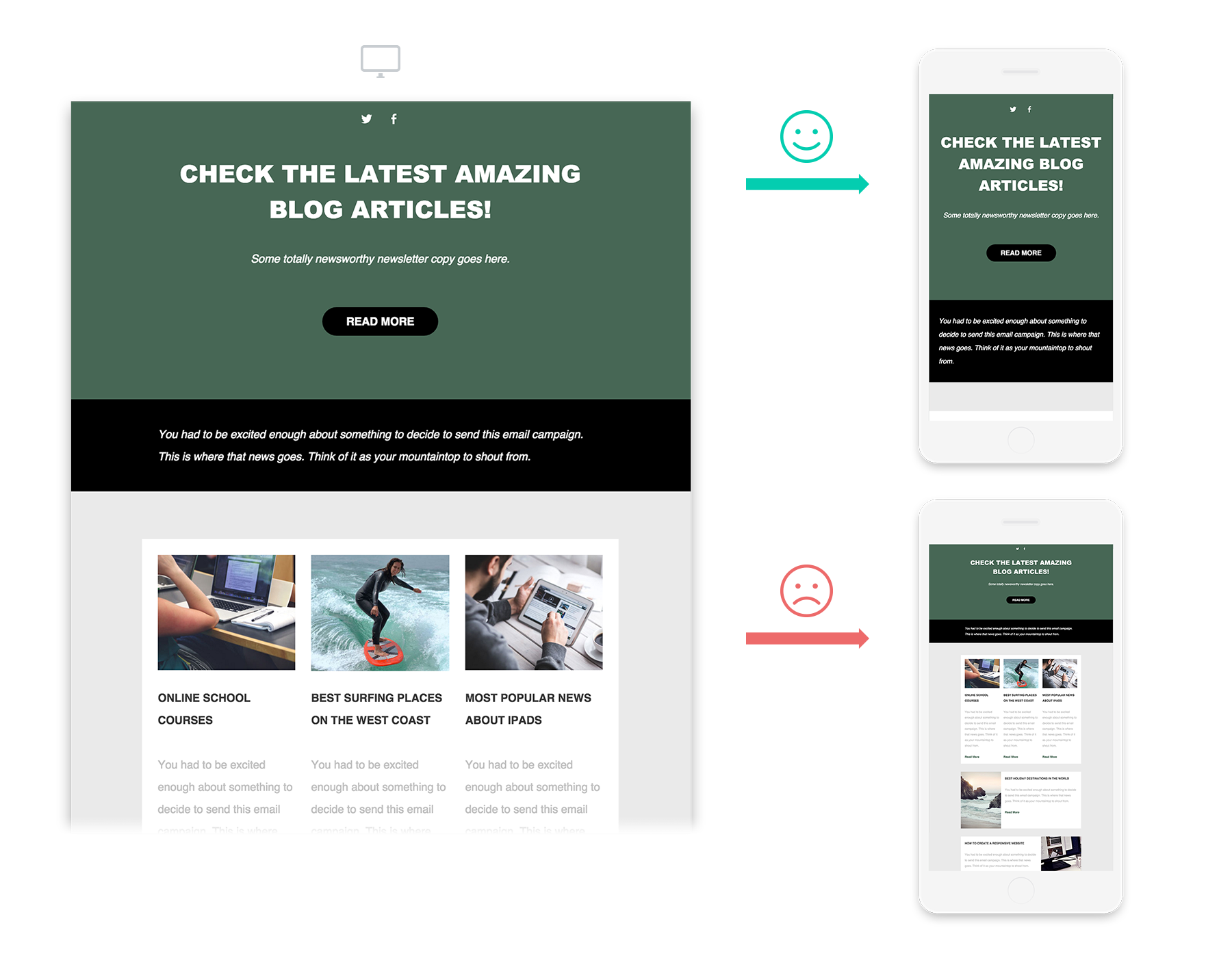
A responsive email will automatically adjust your email layout so that it is visually convenient for your user if they were to use their cellphone to view their email. Below are examples of the same email that is viewed on a desktop, responsive mobile version, and a non-responsive mobile version. Notice how the non- responsive does not stack like the responsive email, and you’ll have to scroll left/right, up/down, in order to view the entire email. With the responsive email, you will only need to scroll up and down.
To learn about Benchmark’s responsive templates Click Here.
If you have additional questions, please feel free to contact our support team via Email, LiveChat or Phone.
